America's Best Water Quality Reports
We read 25 US cities' annual water quality reports line by line and scored how well each one helps residents understand what's in their water, measured against where the EPA's 2027 rules are headed. Philadelphia came out on top.
By TapWaterData Editorial · Updated June 13, 2026 · Independent · Free · No utility paid for placement
Most water reports are written to be filed, not read
Every US utility has to mail you a water quality report once a year. By law it has to list what is in your water. It does not have to be readable, and most are not: studies have found the average report is written at a college reading level, and only a small fraction pass basic accessibility tests.[3] The EPA's 2027 rule revisions finally require clearer, more accessible reports.[1]
A handful of utilities were already there before the rule. We went looking for them. This is a ranking of the report, the thing a resident actually receives, not a ranking of the water itself.
How we scored every report
Five pillars, judged page by page on an identical rubric, sourced from each utility's own published report and EPA data. Weights are published so anyone can re-derive a score.
| Pillar | What it measures | Weight |
|---|---|---|
| Plain-language clarity | Can a non-expert actually read it? | 25% |
| Contaminant transparency | Do they show the numbers — including the bad news? | 25% |
| Information design | Is the data visual, or a wall of tables? | 20% |
| Digital accessibility & delivery | Web-native, mobile, and lookup — or a buried PDF? | 20% |
| Timeliness & completeness | Recent data, full panel. | 10% |
The 2026 honorees
The 10 utilities whose reports do the most to help residents understand their water.
25 reports read · 10 honorees · 15 also reviewed
Every honoree, scored and shown
Each report below earned its place. Open any scorecard for the full pillar-by-pillar breakdown and a look at the report itself.
Philadelphia Water Department
Philadelphia, Pennsylvania · Interactive microsite
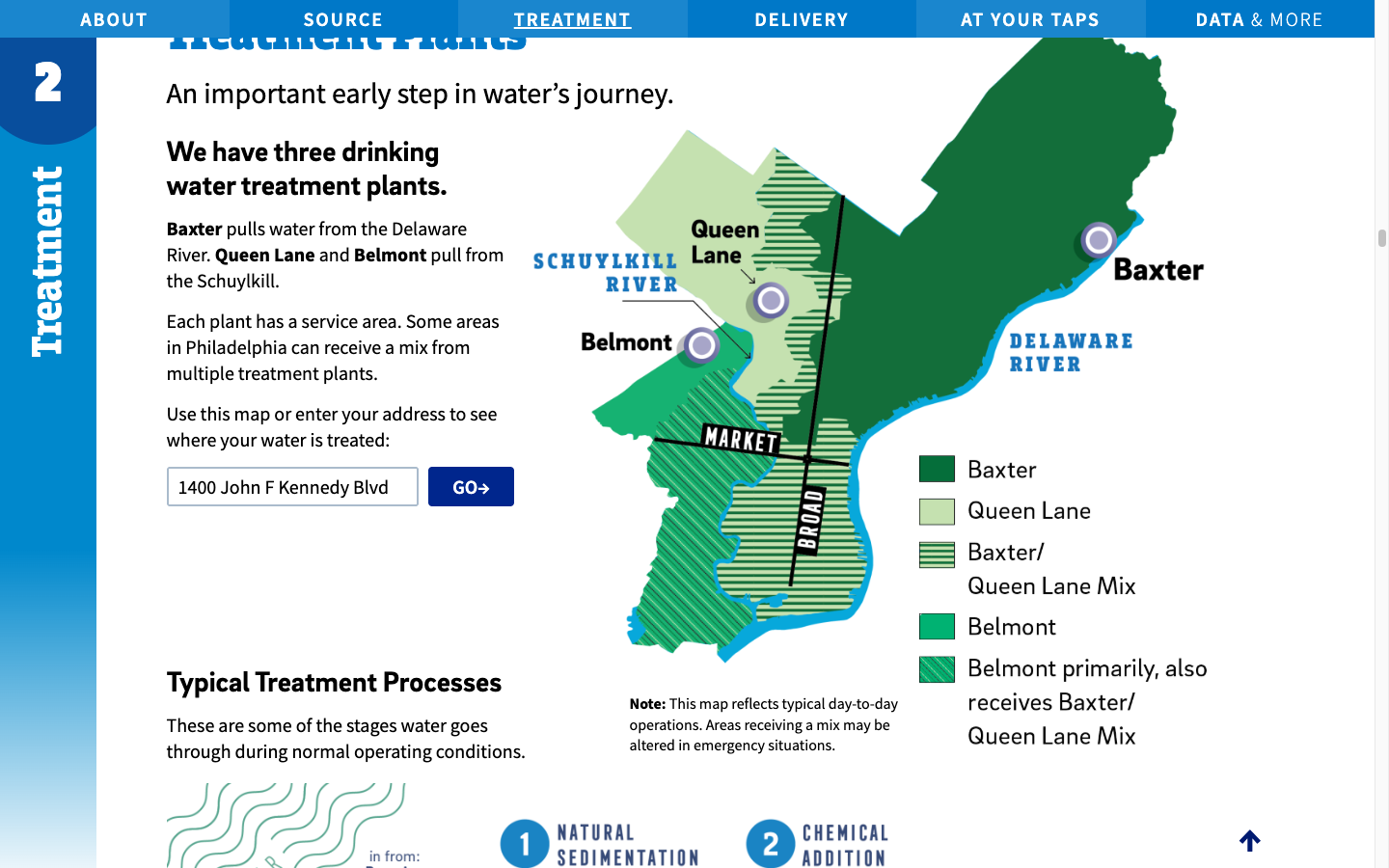
Philadelphia is the only report in the cohort that is at once a magazine-grade publication and a designed, interactive website — it sets the ceiling for what a water quality report can be. It charts its own bad news, like a PFOA result above the limit that takes effect in 2029, instead of burying it, and translates every unit into something you can picture. It gives up a fraction of a point only because the underlying data tables and the closing glossary stay dense.
- •A true interactive microsite, not a PDF — a four-chapter water-journey narrative with a scroll-linked watershed map.
- •An address lookup that shows which of the three treatment plants serves your home, on a color-coded map.
- •PFAS charted against the limits: their highest PFOA result (7.3 ppt) is shown against the 4 ppt EPA limit that compliance does not begin until 2029.
Mount Pleasant Waterworks
Mount Pleasant, SC · PDF report
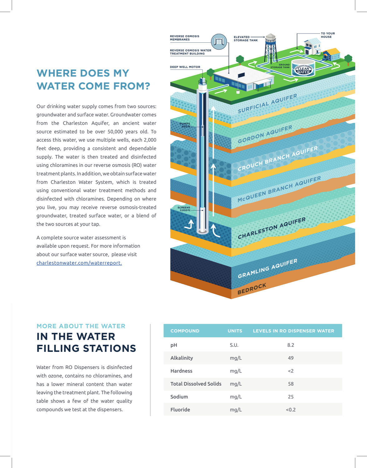
- •The most editorial print piece in the cohort: a custom isometric aquifer cross-section and an illustrated treatment panorama.
- •Lists UCMR5 PFAS values plainly and is candid about the system's history.
Tucson Water
Tucson, AZ · PDF report
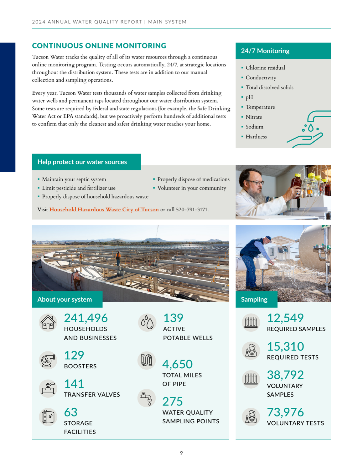
- •The most rigorous voluntary-monitoring story in the cohort: 38,792 voluntary samples against 12,549 required.
- •Discloses a missed-monitoring violation in plain language, naming the six parameters and how it was closed.
DC Water
Washington, DC · PDF report
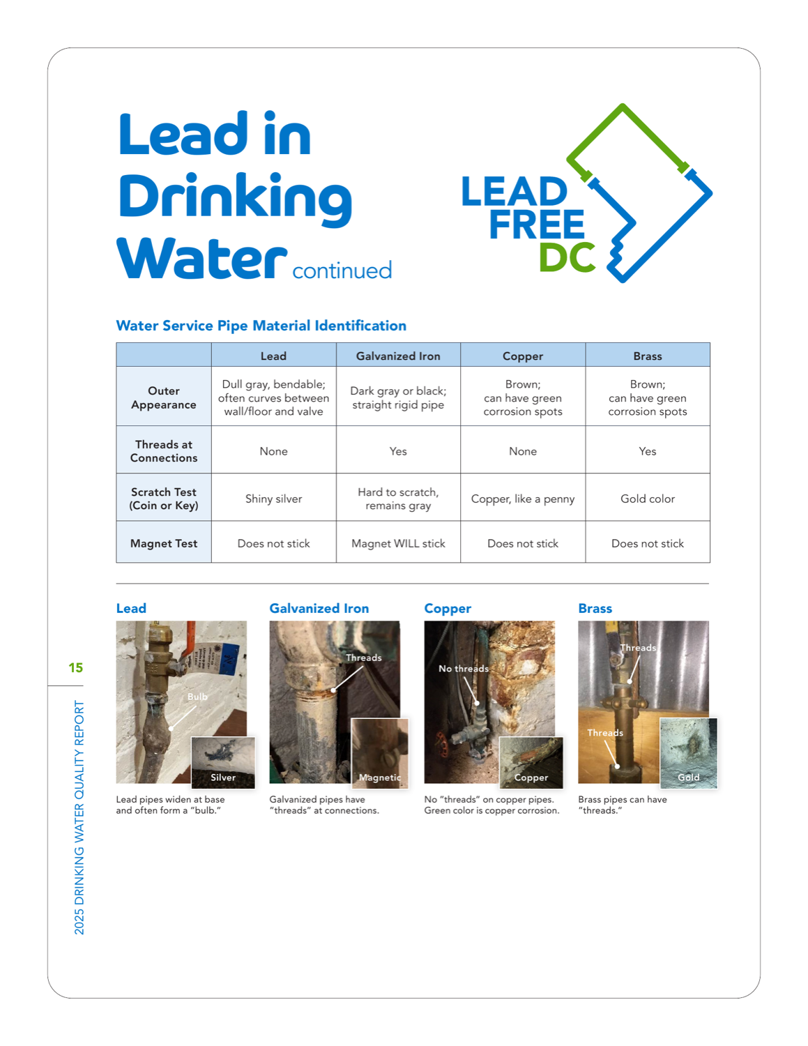
- •The best lead-pipe self-identification content anywhere: a scratch-and-magnet test matrix with annotated basement photos.
- •Voluntary PFAS results shown against the new EPA limits, plus per-site UCMR5 data.
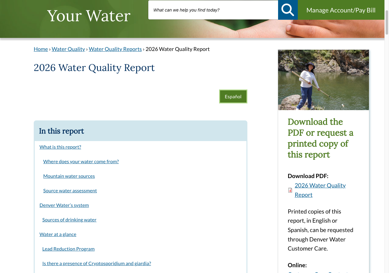
Denver Water
Denver, CO · Web report
- •A genuine HTML report alongside the PDF — jump-link navigation, accordion sections, and per-plant results.
- •Discloses two monitoring violations and a treatment deficiency in a plain-language Q&A.
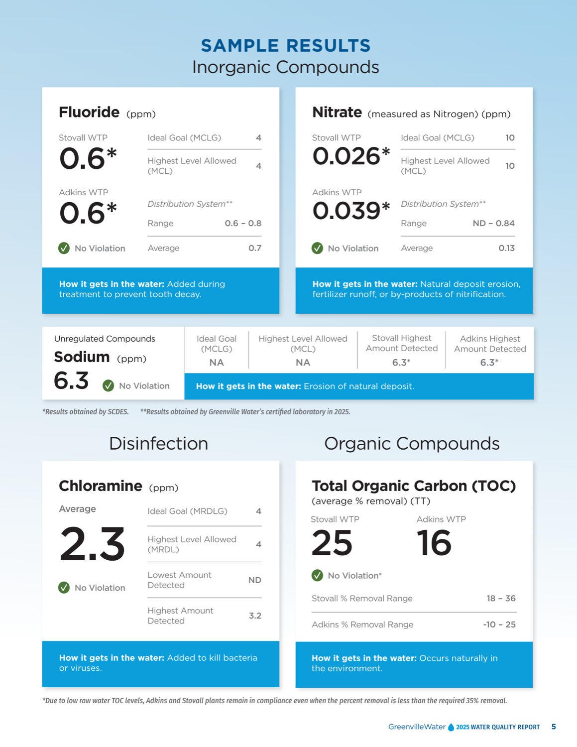
Greenville Water
Greenville, SC · PDF report
- •Abandons the regulatory table entirely: every contaminant is a big-number card with the value, the goal, the limit, and how it gets in the water.
- •Relabels MCLG/MCL as 'Ideal Goal' and 'Highest Level Allowed' so a layperson can read it.
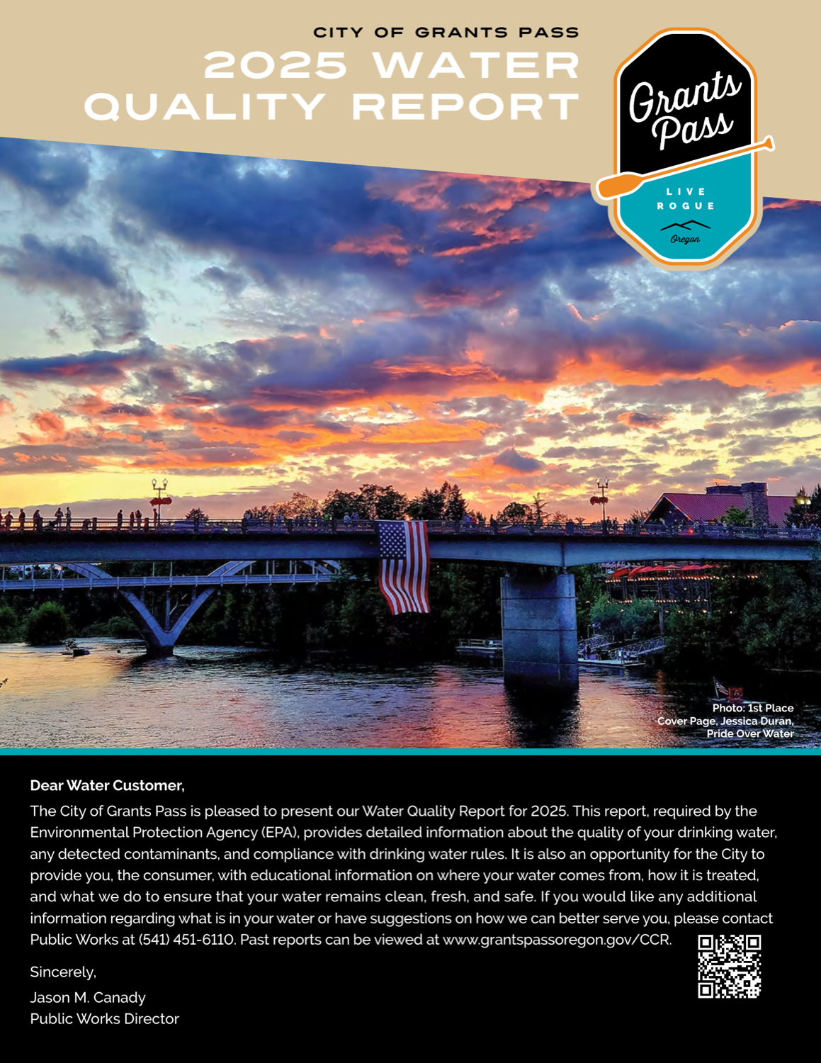
City of Grants Pass
Grants Pass, OR · PDF report
- •Resident photo-contest art direction — winning photos run full-bleed, something no other report attempts.
- •A monthly-usage bar chart with a temperature color band.
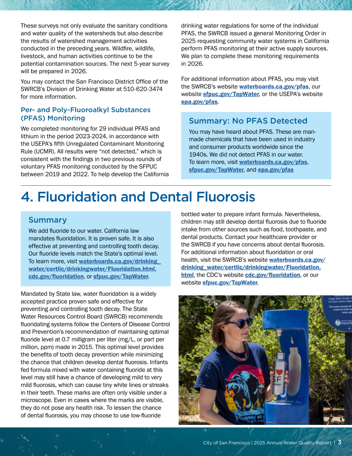
San Francisco Public Utilities Commission
San Francisco, CA · PDF report
- •The plain-language champion: every section opens with a sixth-grade-reading-level summary box.
- •Discloses a turbidity monitoring lapse in honest, plain English.
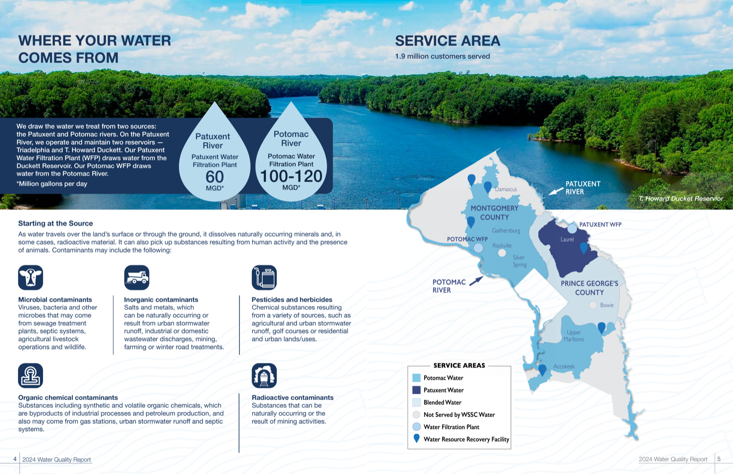
WSSC Water
Laurel, MD · PDF report
- •Corporate-magazine spreads with water-drop stat callouts and a custom tri-source service map.
- •Voluntary monthly PFAS monitoring since 2020, with detected values shown against the limits.
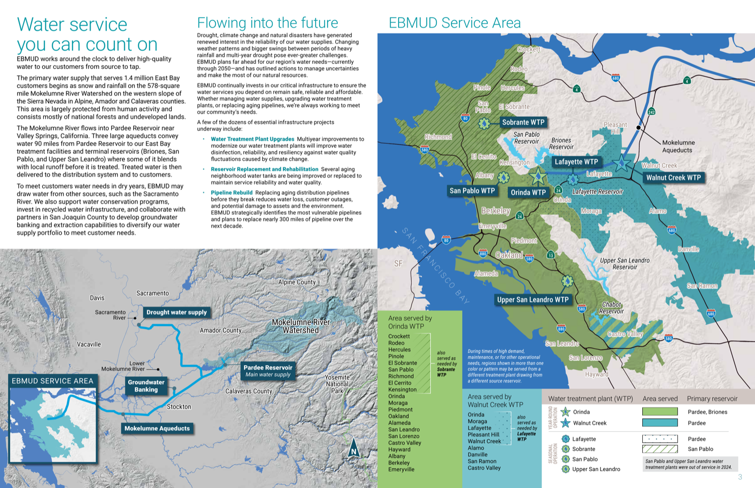
East Bay Municipal Utility District
Oakland, CA · PDF report
- •The smartest table architecture in the cohort: a four-table taxonomy (health / aesthetics / unregulated / customer-interest) keyed to a color-coded service map.
- •A numbered six-step 'how to read the tables' walkthrough with an annotated sample.
What a report that respects you looks like
The best reports share the same handful of moves: they chart contaminants against the limits instead of burying them in a table, they show trends over years, they translate every term, and they disclose their own bad news in plain language. Once you know what to look for, you can judge any utility's report in a few minutes.
How to read your water quality reportWhat even the best report can't tell you
Every report on this list describes the water leaving the treatment plant and moving through the mains. None of them can see your building's plumbing, which is where lead usually enters. Look up your own utility to see what it reports, and if your water shows lead, PFAS, or disinfection byproducts, we can help you match a filter to it.
Recognized? Display your badge
Every honoree has a free, static badge that links back to its scorecard. Open your utility's page to copy it.
Philadelphia Water Department, display your badge
Free to use. It links back to this page so residents can see how the report was scored. Paste this where you list your recognitions.
Independent and free. Displaying the badge does not affect rank. If any detail of your score is off, email us and we will correct it.
We're scoring more utilities.
Get the next edition of the scorecard, plus what we learn reading water reports, in your inbox.
Free forever. Unsubscribe anytime. We never share your email.
Frequently asked questions
- Is this pay-to-play?
- No. No utility paid for placement, and displaying a badge is free and does not affect rank. TapWaterData earns affiliate revenue elsewhere on the site; that revenue is firewalled from this ranking.
- How did you score the reports?
- We read each utility's most recent published water quality report page by page and scored it on five pillars — plain-language clarity, contaminant transparency, information design, digital accessibility, and timeliness — using an identical rubric. The full methodology and weights are published and dated.
- Why isn't my city's utility listed?
- We reviewed 25 utilities in this first edition, weighted toward larger systems and reports with a reputation for design. We are expanding the cohort; if your utility belongs in it, tell us.
- What is the EPA's 2027 CCR rule?
- The EPA's Consumer Confidence Report Rule revisions take effect January 1, 2027 and require reports to be more readable, delivered electronically, and more accessible. Our rubric rewards utilities already meeting that bar.
- Our utility was recognized — can we display the badge?
- Yes. Open your utility's page and copy the badge code. It is free, it links back to your scorecard, and if any detail of your score is off we will correct it.
Also reviewed in the 2026 cohort (15 more)
We read these reports too. They did not place among this year's honorees, most often because the data arrives as a dense table or a download rather than a report built to be read. We score on improvement, not blame, and welcome a second look as reports are updated.
- Austin Water — Austin, TXreport
- Medford Water — Medford, ORreport
- New York City DEP — New York, NYreport
- Akron Water Supply — Akron, OHreport
- City of Burlingame Water — Burlingame, CAreport
- City of Richmond — Richmond, TXreport
- Seattle Public Utilities — Seattle, WAreport
- LADWP — Los Angeles, CAreport
- San Jose Water — San Jose, CAreport
- Fayetteville PWC — Fayetteville, NCreport
- Louisville Water — Louisville, KYreport
- San Diego Public Utilities — San Diego, CAreport
- City of Redmond — Redmond, ORreport
- Massachusetts Water Resources Authority — Boston, MAreport
- Honolulu Board of Water Supply — Honolulu, HIreport
Independence. No utility paid for placement and displaying a badge is free and does not affect rank. TapWaterData earns affiliate revenue from filter recommendations elsewhere on this site; that revenue is firewalled from this ranking, which judges utilities and recommends no products.
Corrections. Scores are drawn from each utility's own published report and public EPA data. If a utility believes a detail is wrong, we review it and correct it. Methodology version 2026, published June 13, 2026.
Stay Informed About Your Water Quality
Get EPA reports, filter recommendations, and safety alerts for your area.
Join 10,000+ people protecting their families. Unsubscribe anytime.