WSSC Water
Laurel, Maryland · 2024 data
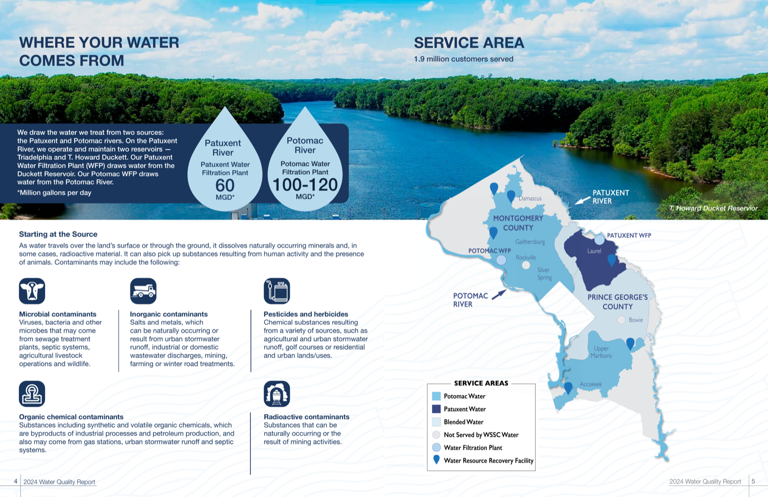
WSSC reads like a corporate magazine — polished spreads, water-drop stat callouts, and a custom map of its three sources. It has monitored PFAS voluntarily since 2020 and lets you compare its two plants side by side. Design flourishes occasionally fight readability, and there is no web-native version, which keeps it in the silver tier.
What their report looks like
How it scored, pillar by pillar
Weighted across five pillars for a 72/100 overall. Each note explains why this report earned that score.
Plain-language clarity25% of score
Generally readable with clear stat callouts, though some body text is wrapped along diagonal shapes, which works against it.
A 5/5 looks like: Every term is translated, units are made tangible (e.g. an Olympic-pool analogy), and each section opens with what it means for you.
Contaminant transparency25% of score
Voluntary monthly PFAS monitoring since 2020 with detected values shown against the limits, plus dual-plant (Patuxent vs Potomac) comparison tables.
A 5/5 looks like: PFAS, lead and any exceedances are shown with real values against the limits, and problems are disclosed plainly rather than buried.
Information design20% of score
Corporate-magazine spreads with water-drop stat callouts and a custom tri-source service map; strong, if occasionally style over substance.
A 5/5 looks like: Contaminant data is visually encoded — charts against limits, multi-year trends, comparisons a layperson reads at a glance.
Digital accessibility & delivery20% of score
A PDF with no responsive web-native report.
A 5/5 looks like: A responsive web-native report with navigation, charts, and an address lookup — not just a PDF.
Timeliness & completeness10% of score
Recent (2024) data with a complete contaminant panel.
A 5/5 looks like: The most recent data year, with a complete contaminant panel including unregulated/emerging compounds.
marks the cohort average across all 25 reviewed reports.
What it does best
- Corporate-magazine spreads with water-drop stat callouts and a custom tri-source service map.
- Voluntary monthly PFAS monitoring since 2020, with detected values shown against the limits.
- Dual-plant comparison tables that let you see Patuxent vs Potomac side by side.
Where it falls short
Some body text is wrapped along diagonal shapes, which hurts readability, and there is no web-native version.
How it compares
WSSC Water's report ranks #9 of 25 reviewed utilities, with a report-clarity score of 72/100 against a cohort median of 69. That places it in the top 36%.
See the full leaderboard
WSSC Water, display your badge
Free to use. It links back to this page so residents can see how the report was scored. Paste this where you list your recognitions.
Independent and free. Displaying the badge does not affect rank. If any detail of your score is off, email us and we will correct it.
Stay Informed About Your Water Quality
Get EPA reports, filter recommendations, and safety alerts for your area.
Join 10,000+ people protecting their families. Unsubscribe anytime.