Philadelphia Water Department
Philadelphia, Pennsylvania · 2024 data
Philadelphia is the only report in the cohort that is at once a magazine-grade publication and a designed, interactive website — it sets the ceiling for what a water quality report can be. It charts its own bad news, like a PFOA result above the limit that takes effect in 2029, instead of burying it, and translates every unit into something you can picture. It gives up a fraction of a point only because the underlying data tables and the closing glossary stay dense.
What their report looks like
How it scored, pillar by pillar
Weighted across five pillars for a 99/100 overall. Each note explains why this report earned that score.
Plain-language clarity25% of score
Every term is translated and the units are made tangible — an Olympic-pool analogy turns ppm/ppb/ppt into something physical — and each chapter opens with what it means for you.
A 5/5 looks like: Every term is translated, units are made tangible (e.g. an Olympic-pool analogy), and each section opens with what it means for you.
Contaminant transparency25% of score
It shows the numbers including the bad news: the highest PFOA result (7.3 ppt) is plotted against the 4 ppt EPA limit that doesn't take effect until 2029, and lead is shown as a 2016–2022 trend against the federal action line.
A 5/5 looks like: PFAS, lead and any exceedances are shown with real values against the limits, and problems are disclosed plainly rather than buried.
Information design20% of score
Contaminants are visually encoded rather than tabulated — a scroll-linked watershed map, charts drawn against the limits, and multi-year trend lines a layperson reads at a glance.
A 5/5 looks like: Contaminant data is visually encoded — charts against limits, multi-year trends, comparisons a layperson reads at a glance.
Digital accessibility & delivery20% of score
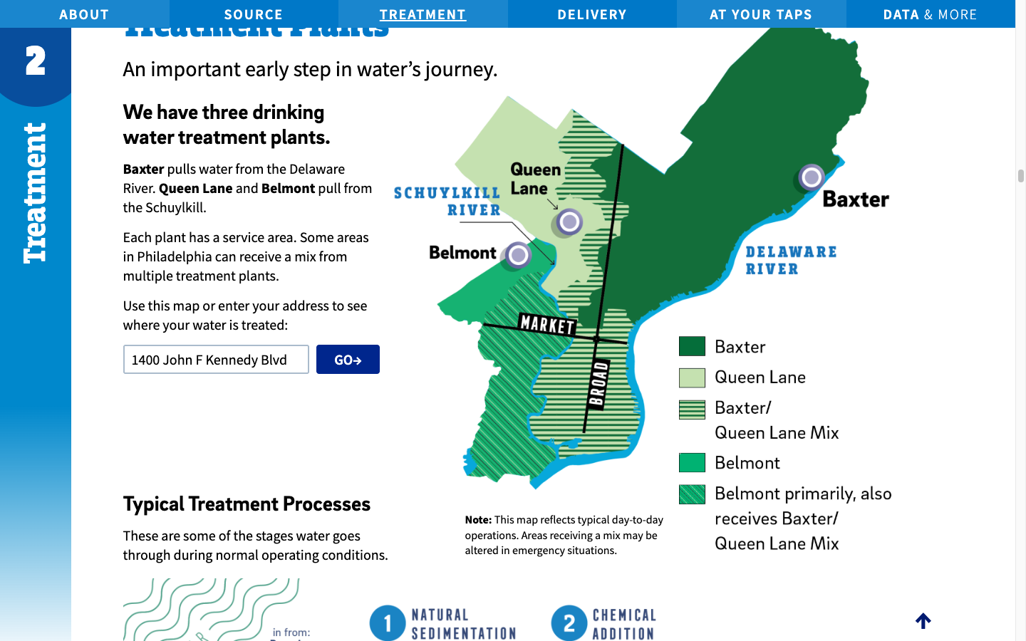
A true responsive, web-native microsite — a four-chapter narrative with navigation and an address lookup that maps your home to one of three treatment plants — not a PDF.
A 5/5 looks like: A responsive web-native report with navigation, charts, and an address lookup — not just a PDF.
Timeliness & completeness10% of score
Built on the most recent (2024) data with a broad panel including PFAS and emerging compounds; just short of perfect because a few sections trail the latest sampling year.
A 5/5 looks like: The most recent data year, with a complete contaminant panel including unregulated/emerging compounds.
marks the cohort average across all 25 reviewed reports.
What it does best
- A true interactive microsite, not a PDF — a four-chapter water-journey narrative with a scroll-linked watershed map.
- An address lookup that shows which of the three treatment plants serves your home, on a color-coded map.
- PFAS charted against the limits: their highest PFOA result (7.3 ppt) is shown against the 4 ppt EPA limit that compliance does not begin until 2029.
- A multi-year lead trend (2016–2022) with the federal action line drawn on it, plus an Olympic-pool analogy for ppm/ppb/ppt.
Where it falls short
Even the strongest report in the country still ends with a text-heavy glossary, and the data tables — while excellent — remain the densest part of the document.
How it compares
Philadelphia Water Department's report ranks #1 of 25 reviewed utilities, with a report-clarity score of 99/100 against a cohort median of 69. No report in the cohort scored higher.
See the full leaderboardWhat even this report can't tell you
A report describes the water leaving the plant, not what reaches your tap — your building's plumbing is where lead usually enters.
See Philadelphia's water data
Philadelphia Water Department, display your badge
Free to use. It links back to this page so residents can see how the report was scored. Paste this where you list your recognitions.
Independent and free. Displaying the badge does not affect rank. If any detail of your score is off, email us and we will correct it.
Stay Informed About Your Water Quality
Get EPA reports, filter recommendations, and safety alerts for your area.
Join 10,000+ people protecting their families. Unsubscribe anytime.