Mount Pleasant Waterworks
Mount Pleasant, South Carolina
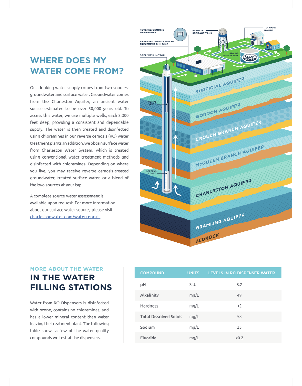
Mount Pleasant is the most beautifully made print report in the cohort — a custom isometric aquifer cross-section and an illustrated treatment panorama give residents a genuine sense of where their water comes from. It is candid about its own history, though its PFAS table leaves out the new federal limits. The craft is trapped in a PDF, which is the main reason it isn't higher.
Scored edition: 2024 Annual Drinking Water Report (2024 data). Mount Pleasant Waterworks has since published its 2025 Annual Drinking Water Report (2025 data), which was not scored.
- Corrected September 13, 2026: Each scorecard now names and links the exact report edition we scored, and notes any newer edition the utility has published. Some report links had pointed to pages that have since moved on to a newer edition.
- Corrected September 13, 2026: The scorecard said the report used 2025 data; it covers 2024. It called the swimming-pool comparison a spread; it is one panel on the page explaining how to read the water quality tables. It said the report avoids a spotless compliance line; the report states that the water meets or surpasses all state and federal standards, and its candor is about the system's pre-1991 history. Its screenshot caption said the cutaway shows exactly which aquifers supply the water; the wells draw from the Charleston Aquifer, and the utility also buys surface water.
- Corrected September 13, 2026: Verdicts that named one factor as the only thing holding a report back now name it as the main one, matching sub-scores in which more than one pillar is below 5.
- Corrected September 13, 2026: Mount Pleasant Waterworks' transparency score changed from 5 to 4, moving it from #2 to #5 (still Gold, now 80/100); Tucson Water, DC Water and Denver Water each move up one place. Its report prints its PFAS results, including PFOS at 6.6 ppt, in a table that gives no limits and says such compounds may not have health-based standards, without mentioning the EPA's 4 ppt limit that result is above. The top transparency score calls for results shown against the limits and problems disclosed plainly.
What their report looks like
How it scored, pillar by pillar
Weighted across five pillars for a 80/100 overall. Each note explains why this report earned that score.
Plain-language clarity25% of score
Its guide to reading the water quality tables makes parts-per-trillion tangible — 'one drop of water in 20 Olympic-sized swimming pools' — and the illustrated narrative explains the system in plain terms.
A 5/5 looks like: Every term is translated, units are made tangible (e.g. an Olympic-pool analogy), and each section opens with what it means for you.
Contaminant transparency25% of score
Prints its lead results against the action level and its UCMR 5 PFAS results, and is candid about the system's history — before 1991 its water fell short of secondary standards related to taste and appearance. But its PFAS table gives no limits and says such compounds may not have health-based standards, with no mention of the EPA's 4 ppt limit for PFOS, which its 6.6 ppt result is above.
A 5/5 looks like: PFAS, lead and any exceedances are shown with real values against the limits, and problems are disclosed plainly rather than buried.
Information design20% of score
Among the best-designed in the cohort — a custom isometric aquifer cross-section and an illustrated treatment panorama — just short of the visual data-encoding of the very top reports.
A 5/5 looks like: Contaminant data is visually encoded — charts against limits, multi-year trends, comparisons a layperson reads at a glance.
Digital accessibility & delivery20% of score
All of that craft is locked in a PDF; there is no responsive web-native version, so the digital experience lags the print.
A 5/5 looks like: A responsive web-native report with navigation, charts, and an address lookup — not just a PDF.
Timeliness & completeness10% of score
A complete contaminant panel.
A 5/5 looks like: The most recent data year, with a complete contaminant panel including unregulated/emerging compounds.
marks the cohort average across all 25 reviewed reports.
What it does best
- The most editorial print piece in the cohort: a custom isometric aquifer cross-section and an illustrated treatment panorama.
- Lists its UCMR 5 PFAS values and is candid about the system's history.
- A swimming-pool comparison for ppm, ppb and ppt that makes parts-per-trillion tangible.
Where it falls short
All of that craft is locked in a PDF, so the digital experience lags the print, and its PFAS table gives values without the new federal limits — including a PFOS result above one.
How it compares
Mount Pleasant Waterworks's report ranks #5 of 25 reviewed utilities, with a report-clarity score of 80/100 against a cohort median of 69. That places it in the top 20%.
See the full leaderboardWhat even this report can't tell you
A report describes the water leaving the plant, not what reaches your tap — your building's plumbing is where lead usually enters.
See Mount Pleasant's water data
Mount Pleasant Waterworks, display your badge
Free to use. Both versions link back to this page so residents can see how the report was scored. Paste either one where you list your recognitions; use the text link if your site strips images.
Independent and free. Displaying the badge does not affect rank. If any detail of your score is off, email hello@tapwaterdata.com and we will review the source and correct it.
Get the Weekly Water Brief
One email a week on water testing, treatment, and what water-quality data means for your home.
One email a week. Unsubscribe anytime.