East Bay Municipal Utility District
Oakland, California · 2024 data
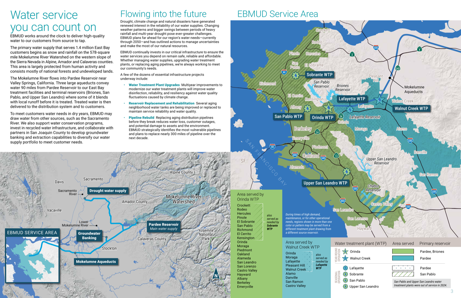
East Bay MUD has the smartest table architecture in the cohort — a four-part taxonomy keyed to a color-coded service map, with a numbered walkthrough teaching residents how to read it. It even prints unregulated detections most utilities hide. A stock-photo cover, a web-deferred PFAS panel, and no online version keep it in the silver tier.
What their report looks like
How it scored, pillar by pillar
Weighted across five pillars for a 70/100 overall. Each note explains why this report earned that score.
Plain-language clarity25% of score
A numbered six-step “how to read the tables” walkthrough with an annotated sample lowers the barrier to an otherwise dense subject.
A 5/5 looks like: Every term is translated, units are made tangible (e.g. an Olympic-pool analogy), and each section opens with what it means for you.
Contaminant transparency25% of score
Prints unregulated detections (PFBA, NDMA, chlorate) rather than hiding them; held back only because the PFAS-6 panel is deferred to the web.
A 5/5 looks like: PFAS, lead and any exceedances are shown with real values against the limits, and problems are disclosed plainly rather than buried.
Information design20% of score
The smartest table architecture here — a four-table taxonomy (health, aesthetics, unregulated, customer-interest) keyed to a color-coded service map — though it organizes tables rather than charting them.
A 5/5 looks like: Contaminant data is visually encoded — charts against limits, multi-year trends, comparisons a layperson reads at a glance.
Digital accessibility & delivery20% of score
No responsive online report, and the cover leans on stock photography.
A 5/5 looks like: A responsive web-native report with navigation, charts, and an address lookup — not just a PDF.
Timeliness & completeness10% of score
Recent (2024) data with a broad panel including unregulated compounds.
A 5/5 looks like: The most recent data year, with a complete contaminant panel including unregulated/emerging compounds.
marks the cohort average across all 25 reviewed reports.
What it does best
- The smartest table architecture in the cohort: a four-table taxonomy (health / aesthetics / unregulated / customer-interest) keyed to a color-coded service map.
- A numbered six-step 'how to read the tables' walkthrough with an annotated sample.
- Prints unregulated detections (PFBA, NDMA, chlorate) rather than hiding them.
Where it falls short
The cover is pure stock photography, the PFAS-6 panel is web-deferred, and there is no responsive online report.
How it compares
East Bay Municipal Utility District's report ranks #10 of 25 reviewed utilities, with a report-clarity score of 70/100 against a cohort median of 69. That places it in the top 40%.
See the full leaderboardWhat even this report can't tell you
A report describes the water leaving the plant, not what reaches your tap — your building's plumbing is where lead usually enters.
See Oakland's water data
East Bay Municipal Utility District, display your badge
Free to use. It links back to this page so residents can see how the report was scored. Paste this where you list your recognitions.
Independent and free. Displaying the badge does not affect rank. If any detail of your score is off, email us and we will correct it.
Stay Informed About Your Water Quality
Get EPA reports, filter recommendations, and safety alerts for your area.
Join 10,000+ people protecting their families. Unsubscribe anytime.