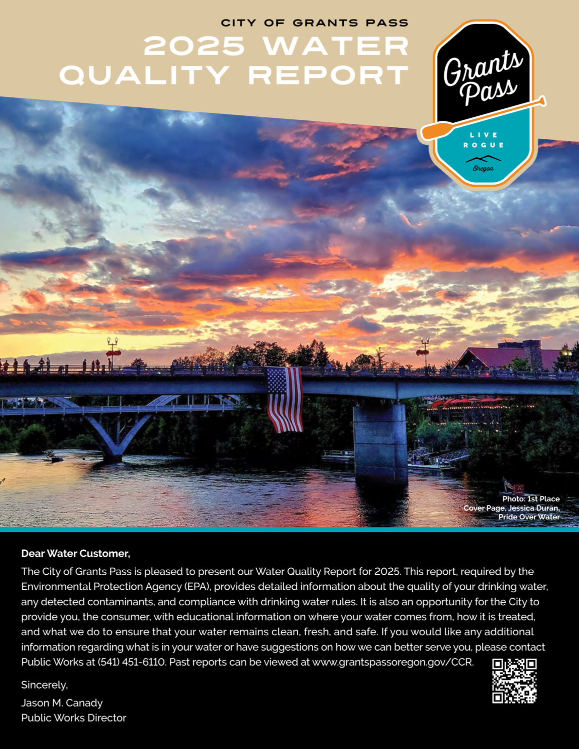
City of Grants Pass
Grants Pass, Oregon · 2025 data
Grants Pass is the most charming report in the cohort — it runs resident photo-contest winners full-bleed and frames its data around the community it serves. It is also honest, owning two HAA5 samples that ran over the limit. It stays in the silver tier because, underneath the art direction, it is a conventional PDF.
What their report looks like
How it scored, pillar by pillar
Weighted across five pillars for a 73/100 overall. Each note explains why this report earned that score.
Plain-language clarity25% of score
Approachable and community-facing, with a monthly-usage bar chart banded by temperature; most terms are explained, a few stay technical.
A 5/5 looks like: Every term is translated, units are made tangible (e.g. an Olympic-pool analogy), and each section opens with what it means for you.
Contaminant transparency25% of score
Honestly frames two HAA5 samples over the limit against a compliant running average rather than omitting them.
A 5/5 looks like: PFAS, lead and any exceedances are shown with real values against the limits, and problems are disclosed plainly rather than buried.
Information design20% of score
Distinctive art direction — full-bleed resident photo-contest winners — though the data tables themselves stay conventional.
A 5/5 looks like: Contaminant data is visually encoded — charts against limits, multi-year trends, comparisons a layperson reads at a glance.
Digital accessibility & delivery20% of score
A PDF with no responsive web-native version.
A 5/5 looks like: A responsive web-native report with navigation, charts, and an address lookup — not just a PDF.
Timeliness & completeness10% of score
Recent (2025) data with a complete contaminant panel.
A 5/5 looks like: The most recent data year, with a complete contaminant panel including unregulated/emerging compounds.
marks the cohort average across all 25 reviewed reports.
What it does best
- Resident photo-contest art direction — winning photos run full-bleed, something no other report attempts.
- A monthly-usage bar chart with a temperature color band.
- Honestly frames two HAA5 samples over the limit against a compliant running average.
Where it falls short
The community-sourced design is a delight, but it is still a PDF and the data presentation is conventional.
How it compares
City of Grants Pass's report ranks #7 of 25 reviewed utilities, with a report-clarity score of 73/100 against a cohort median of 69. That places it in the top 28%.
See the full leaderboard
City of Grants Pass, display your badge
Free to use. It links back to this page so residents can see how the report was scored. Paste this where you list your recognitions.
Independent and free. Displaying the badge does not affect rank. If any detail of your score is off, email us and we will correct it.
Stay Informed About Your Water Quality
Get EPA reports, filter recommendations, and safety alerts for your area.
Join 10,000+ people protecting their families. Unsubscribe anytime.